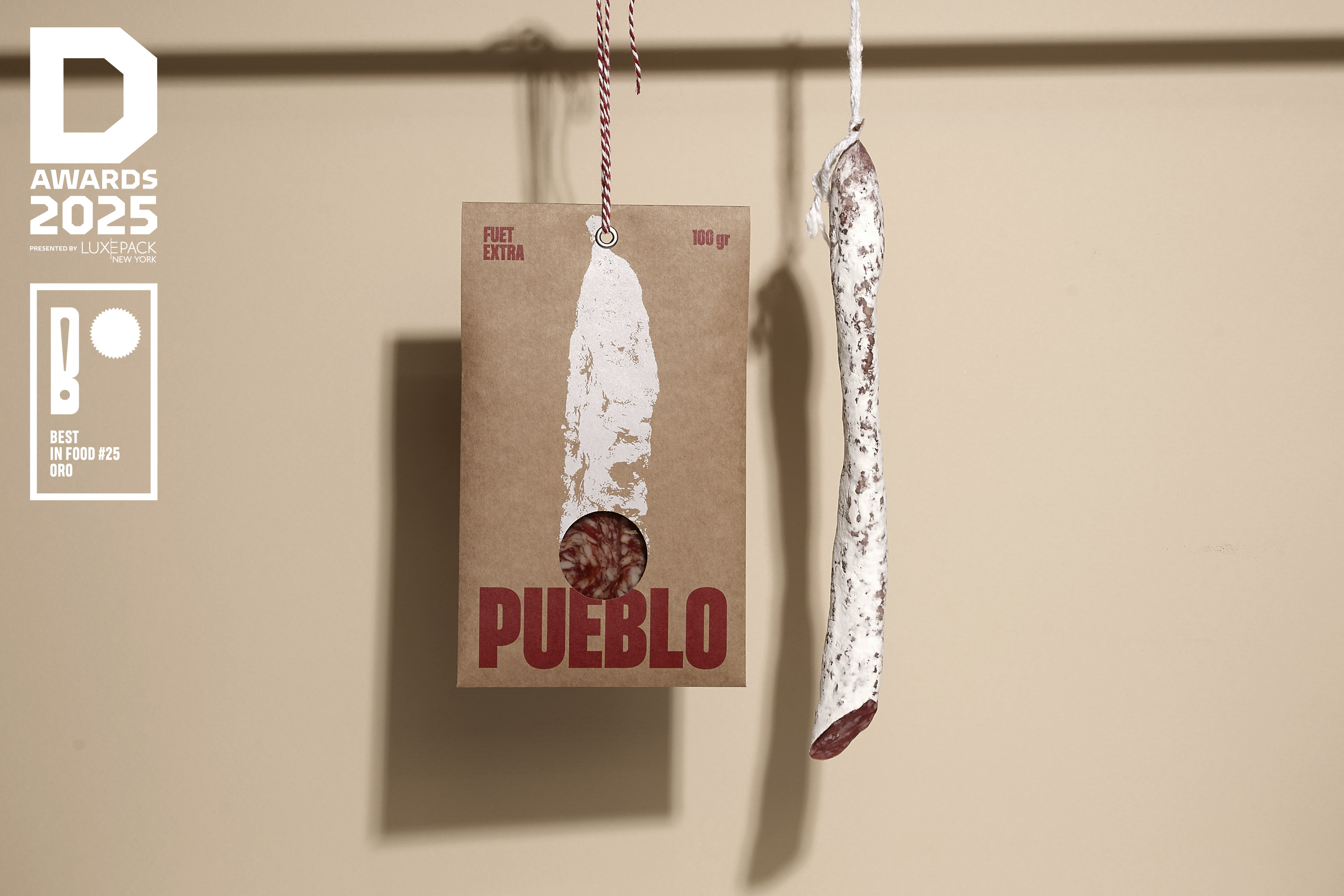
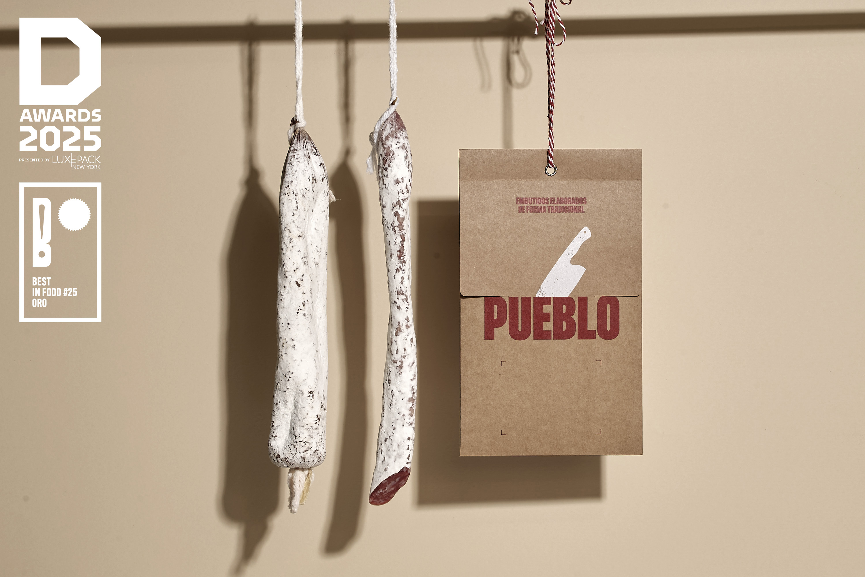
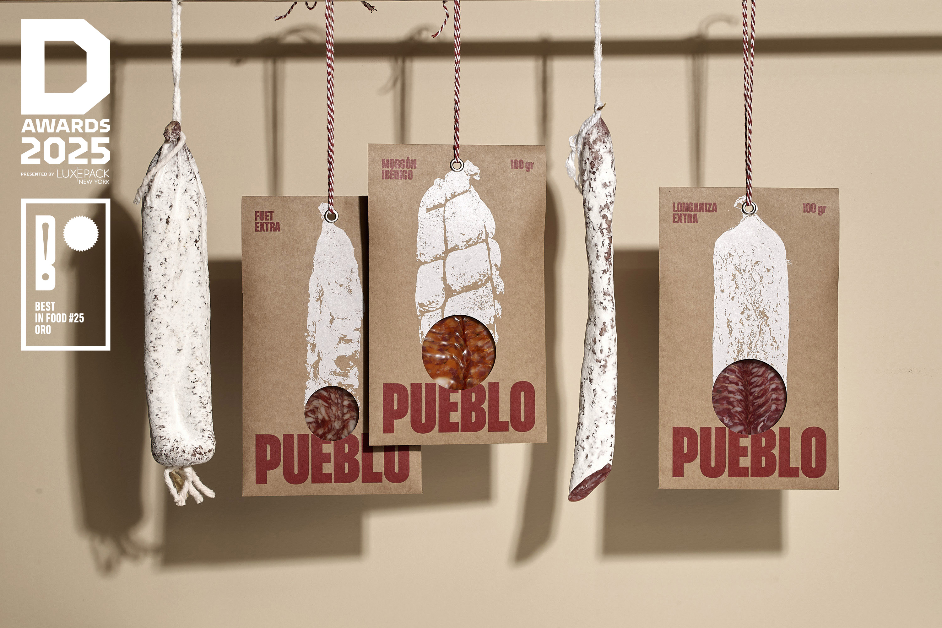
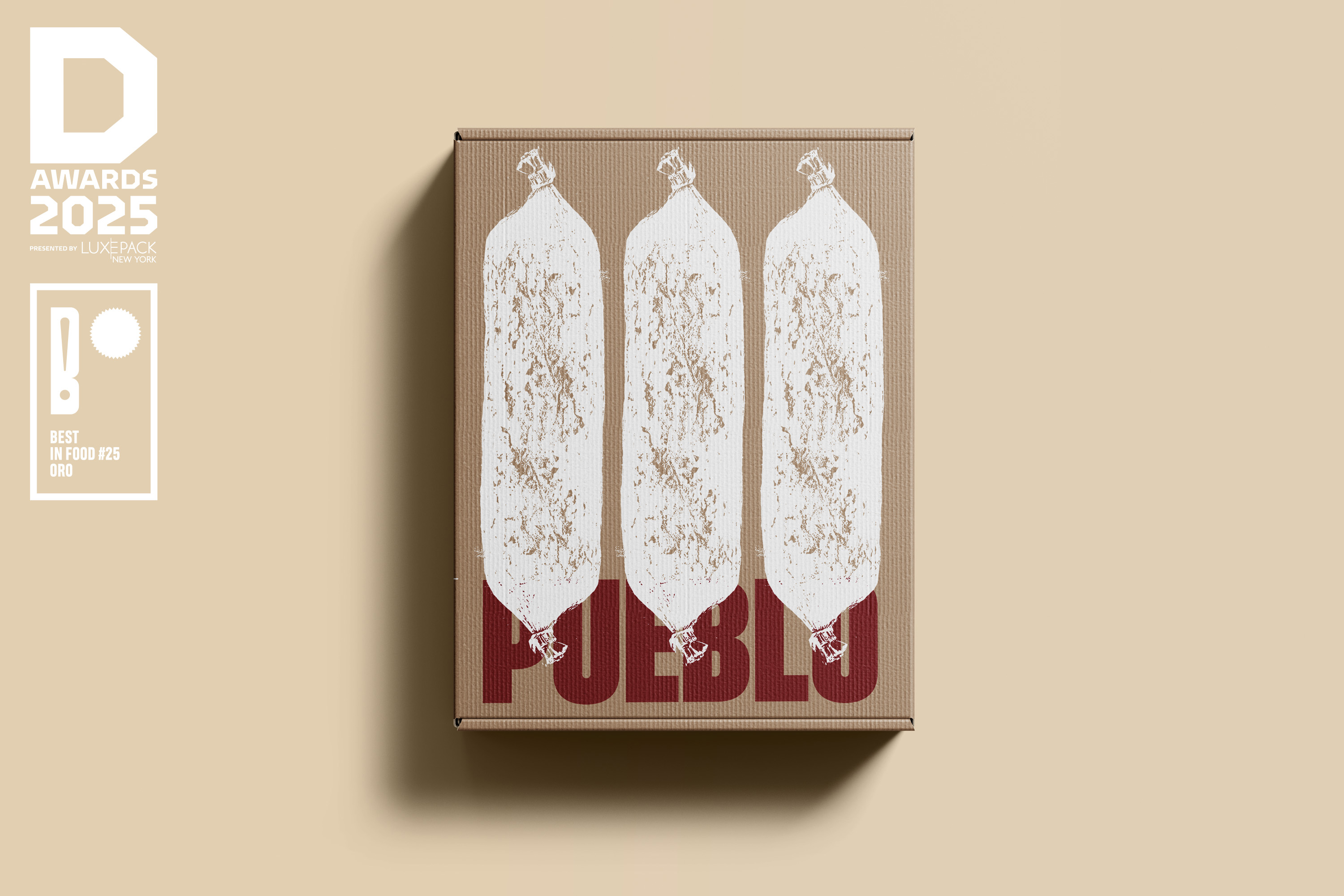
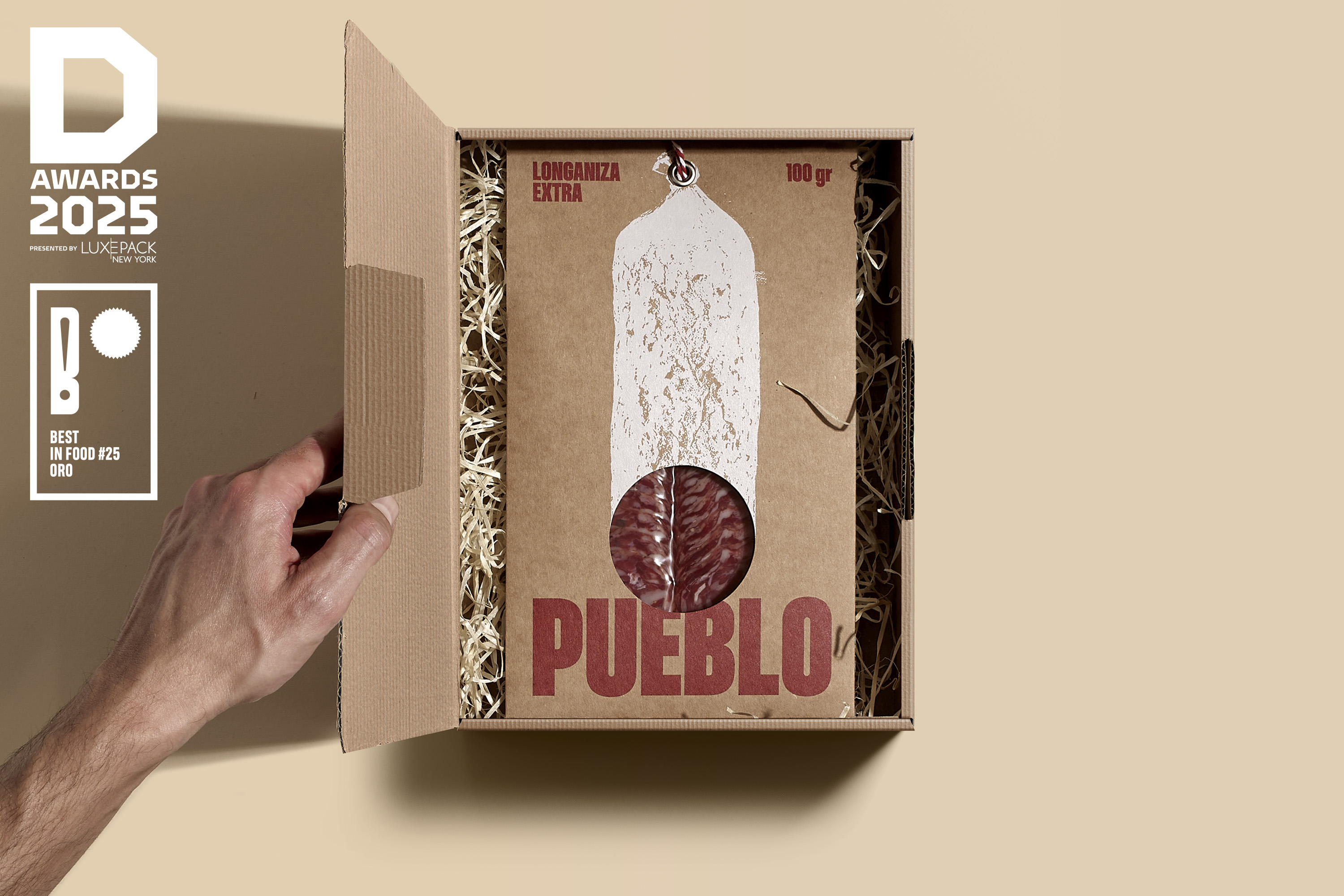
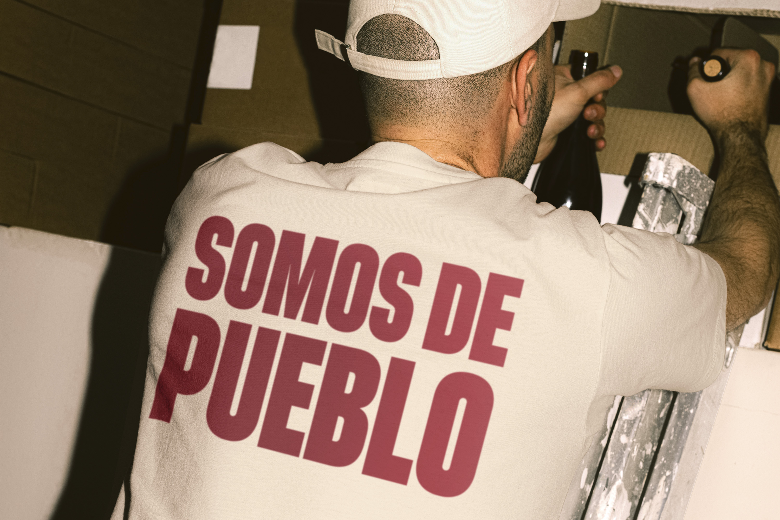
“Pueblo” (village): a bold tribute to our roots. It’s about celebrating the things that matter—authenticity, tradition, and a craft that’s been perfected over generations. Deep down, we all carry a piece of the village in us.
To bring the spirit of “Pueblo” to life, the design leans on three pillars: typography, materials and presentation.
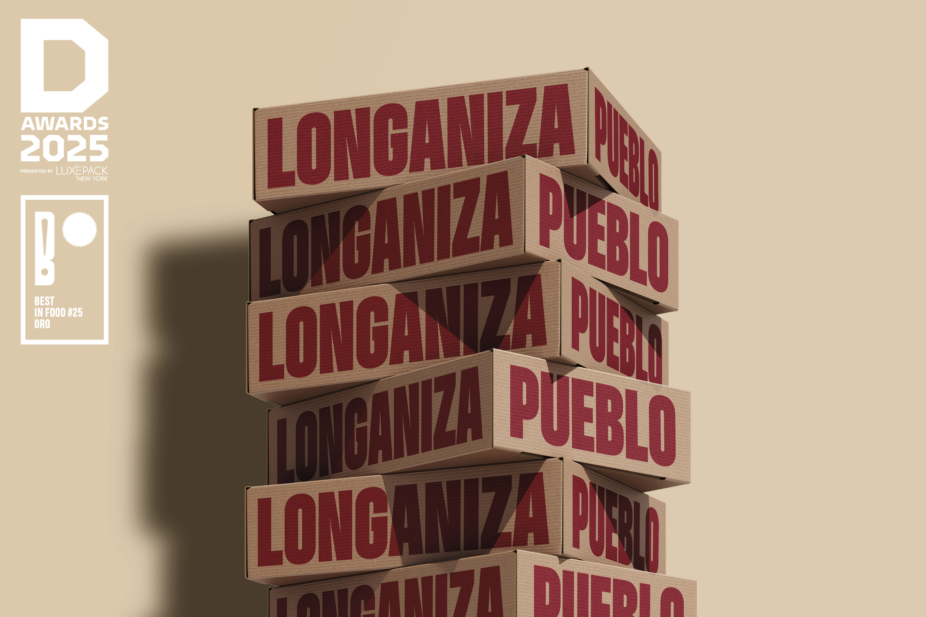
The name itself exudes strength and meaning, so it became the focal point of the design. Bold typography, paired with earthy, nostalgic colors like the red of adobe bricks from old village homes and the golden yellow of sun-dried straw, evokes a deep connection to Spanish heritage.
Finally, no Spanish cold meat would be complete without the iconic rope used in the drying and curing process. This essential detail adds the perfect finishing touch to a minimalist yet impactful presentation.
To bring the spirit of “Pueblo” to life, the design leans on three pillars: typography, materials and presentation.
The name itself exudes strength and meaning, so it became the focal point of the design. Bold typography, paired with earthy, nostalgic colors like the red of adobe bricks from old village homes and the golden yellow of sun-dried straw, evokes a deep connection to Spanish heritage.
Finally, no Spanish cold meat would be complete without the iconic rope used in the drying and curing process. This essential detail adds the perfect finishing touch to a minimalist yet impactful presentation.
Project: Branding & Packaging.
Year: 2024
Country: Spain
Year: 2024
Country: Spain